When you acquire EDS or BEX image maps, you generate layered data with electron images and several individual element maps. The false coloured image maps help by visualising the abundance and distribution of the different elements in your samples. When displaying these kinds of data, appropriate selection of colour impacts the viewers capability for interpretation. Therefore, selecting the colours for each channel can be key when preparing scientific figures (there is always a relevant xkcd).
In this blog post, I will talk about colour selection and map data display in AZtec (and Relate) and how good colour use makes a big difference to present information effectively.
See the detail in colour
When you visualise the element maps overlayed with the electron image, you combine the ultrastructural information with the elemental analysis.
In AZtec, you can adjust the visualisation options for these layered maps in the Maps navigator > Construct Maps step. As illustrated in Figure 1, for each layer, you can edit the colour options by:
- Selecting the colour from a list of 12 preset colours.
- Selecting a custom colour from a scale of 360 hues (and black and white for greyscale).
- Adjusting the colour bar for each channel to adjust the brightness and contrast of each layer.
- Toggling on/off the layers that you want to be visible (including the electron image).
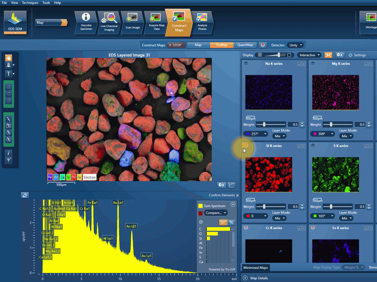
Figure 1: options for selecting colours in AZtec.
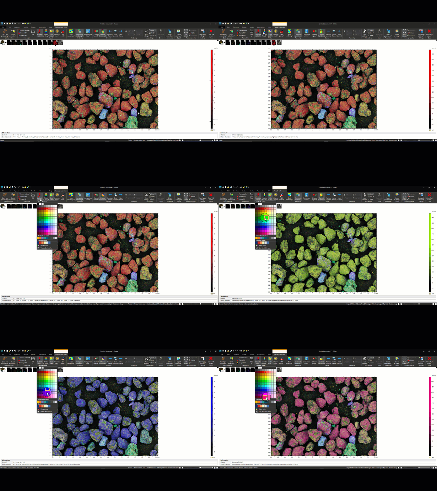
If you export your maps to Relate, you can also change the colour of each channel in the “Studiable Color” menu (Figure 2).

Figure 2: colour selection in Relate
The rainbow palette problem
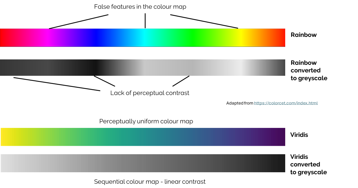
The rainbow colour palette (or colour map) is very commonly used for false-colouring data due to its aesthetical appeal. Unfortunately, this may not translate into an effective way of communicating differences in the data. This is because the rainbow colour palette is not perceptually uniform, which means viewers may miss significant features and create false anomalies. Being aware of this is essential when generating multilayered images to display as scientific figures.
Selecting colours for multilayered images
For the purposes of clear scientific communication, it is essential to consider advantages and disadvantages of existing colour maps (as well as being aware of how they perform with different types of colour blindness).
Some freely available resources that will help you prepare clear scientific figures are:
Below, (Figure 3) I used some of the different colour maps in a multilayer image map collected with BEX to show how it impacts the final figure (sand samples from Shannon Stockdale).
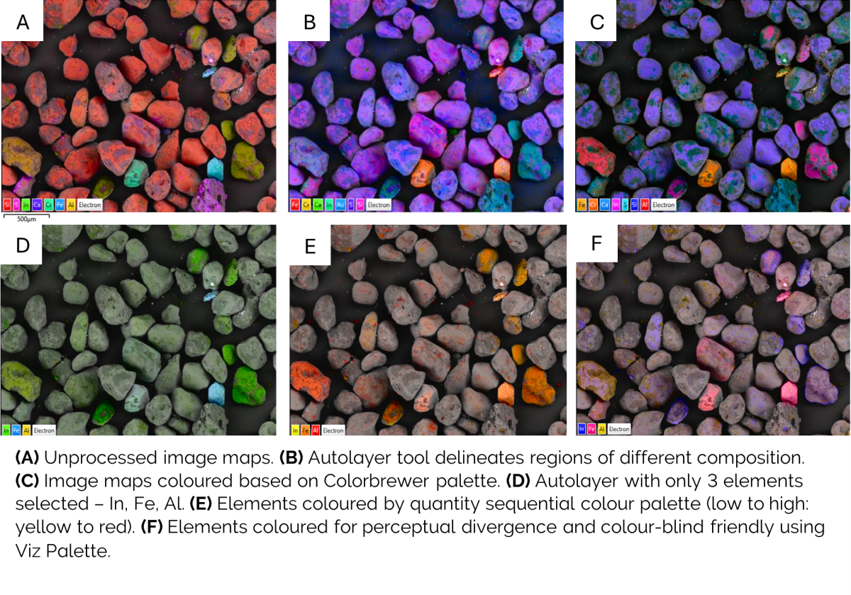
Changing the palettes of the image above can bring order to chaos, combine aesthetic value with clear communication, as well as highlight quantity or differences in localisation. Make use of colour to give your image maps a red carpet look and wow your scientific audience.
References:
https://www.sciencedirect.com/science/article/pii/S0924271622002659
https://towardsdatascience.com/why-the-rainbow-color-map-is-problematic-23293d0937d5
https://blogs.mathworks.com/steve/2014/10/20/a-new-colormap-for-matlab-part-2-troubles-with-rainbows/
https://www.kennethmoreland.com/color-advice/
https://matplotlib.org/stable/users/explain/colors/colormaps.html
https://www.fabiocrameri.ch/


